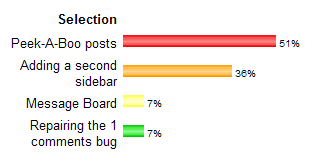
Tuesday, October 24, 2006
Poll Closed
Sunday, October 22, 2006
A simple Photo Album
If you like to have a simple photo album on your blog, here is an easy
to implement solution, without any javascript! It is just CSS, and a
bunch of html-links to the pictures you want to display. I found this
toy at Stu Nichols's CSSPlay, and wanted to share it with you.
Attention: if you add this to your Blog using the Blogger editor (as I did), Blogger adds <br/>-tags where it sees new lines. These <br/>-tags mess up the album when displayed with Firefox.
First, you have to add the following CSS to your style-sheet.
/* Photo album */
#album {
width:320px;
height:360px;
background:#eee url(deer.jpg) 0 40px no-repeat;
border:1px solid #aaa;
margin:0 auto;
text-align:center;
}
.gallery {
position: relative;
margin: 320px 0 0 0;
width: 320px;
padding: 0;
list-style-type: none;
}
.gallery img {
border: 0;
}
.gallery li {
float: left;
}
.gallery li a, .gallery li a:visited {
font-size:11px;
float:left;
text-decoration:none;
color:#000;
background:#fff;
text-align:center;
width:26px;
height:26px;
line-height:24px;
border:1px solid #444;
margin:2px;
}
.gallery li a img {
position:absolute;
top:-320px;
left:0;
visibility:hidden;
border:0;
padding:0;
}
.gallery li a img.landscape {
top:-280px;
}
.gallery li a img.portrait {
left:0;
border-left:40px solid #eee;
border-right:40px solid #eee;
}
.gallery li a:hover {
background:#ddd;
}
.gallery li a:active img, .gallery li a:focus img {
visibility:visible;
}
.gallery li a:active, .gallery li a:focus {
background:#444;
color:#fff;
}
*/ End photo album */
Second, find the a:link definition in your CSS, and add definitions for a:visited, a:hover and a:active. you can format these anyway you like, but they must be in your template for the photo-album to work correctly (because of a bug in IE).
Third, at the spot where you want the album to appear, add the following html:
<div id="album">
<ul class="gallery">
<li><a href="#nogo">01<img class="landscape" src="image1.jpg" alt="image 1" title="image 1" />&;t;/a></li>
<li><a href="#nogo">02<img class="portrait" src="image2.jpg" alt="image 2" title="image 2" />&;t;/a></li>
<li><a href="#nogo">03<img class="portrait" src="image3.jpg" alt="image 3" title="image 3" />&;t;/a></li>
<li><a href="#nogo">04<img class="landscape" src="image4.jpg" alt="image 4" title="image 4" />&;t;/a></li>
<li><a href="#nogo">05<img class="portrait" src="image5.jpg" alt="image 5" title="image 5" />&;t;/a></li>
<li><a href="#nogo">06<img class="portrait" src="image6.jpg" alt="image 6" title="image 6" />&;t;/a></li>
<li><a href="#nogo">07<img class="landscape" src="image7.jpg" alt="image 7" title="image 7" />&;t;/a></li>
<li><a href="#nogo">08<img class="landscape" src="image8.jpg" alt="image 8" title="image 8" />&;t;/a></li>
<li><a href="#nogo">09<img class="portrait" src="image9.jpg" alt="image 9" title="image 9" />&;t;/a></li>
<li><a href="#nogo">10<img class="landscape" src="image10.jpg" alt="image 10" title="image 10" />&;t;/a></li>
</ul>
</div>
Each img src has to point to a picture. The class of this picture can be portrait or landscape.
Saturday, October 21, 2006
Using a Lightbox
I got a request for developing a Lightbox plug-in for Blogger Beta. Well, here it is!
A Lightbox is a sort of pop-up box, displaying an image over the webpage. It is not a new browser window, but a box that floats over your current browser window.
If you want to see an example, please click on the image below.

If you want to have this Lightbox on your Blog, follow the instructions:
Step 1: Backup your template.
Step 2: Download the following files:
LightBox Javascript code.
Loading-image.
Close-image.
Step 3: Add the following line of code to your template, inside the <head>-section:
<script type='text/javascript' src='yourhost/lightbox.js'/>
Replace "yourhost" with the domainname of the place where you host your scripts and images. Save your template.
Step 4: Upload files
Upload the image files to your webhost. Open the javascript-file in Notepad, and edit the url's of the image-files, so that they link to your host. Save the javascript-file, and upload it too.
Step 5: Adding CSS
Add CSS to style your lightbox.
#lightbox{
background-color:#eee;
padding: 10px;
border-bottom: 2px solid #666;
border-right: 2px solid #666;
}
#lightboxDetails{
font-size: 0.8em;
padding-top: 0.4em;
}
#lightboxCaption{ float: left; }
#keyboardMsg{ float: right; }
#lightbox img{ border: none; }
#overlay img{ border: none; }
Step 6: Editing your post
Create a post and upload an image. Enter your text, and just make it a nice post.
Then, inside the <a href="..." > tags, add rel="lightbox" and title="Your title" and publish your post. If you click on the image, the large version of your image will pop out of the screen.
Check out this link for more info on lightboxes.
Adding a second sidebar to your Blog - part 2
In one of my older posts, I gave a short tutorial on how to add a second
sidebar to your Blog. Recently I got some comments of people who got
stuck, so I decided to post a second, more detailed tutorial on how to
rig up a second sidebar.
Understanding structure and layout.
First of all, you have to understand that your Blog Layout consists of several sections. The standard Blogger template has a Header-section, a Sidebar-section, a Main-section and a Footer-section. Inside these section Blogger puts the widgets, these are the page-elements that you can select from the Template-tab.
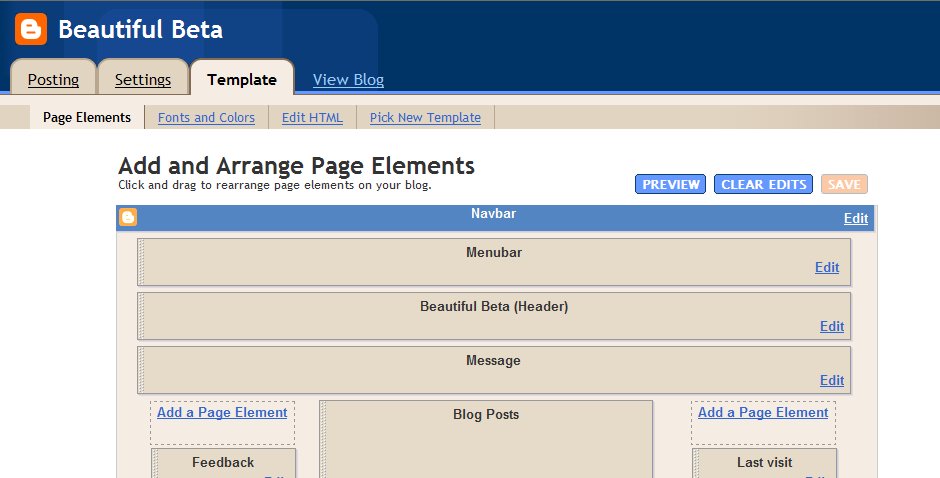
Now, let's take a look at the structure of a standard Blog. If you create a fresh, new Blog, the Page Elements Tab looks like this:
 This Layout has 4 sections: Header, Main (with the Blog Posts), Sidebar and Footer.
The HTML-template looks like this (the line-numbers are added for reference only):
010: <body>
020: <div id='outer-wrapper'>l<div id='wrap2'>
030: <!-- skip links for text browsers -->
040: <span id='skiplinks' style='display:none;'>
050: <a href='#main'>skip to main </a>
060: <a href='#sidebar'>skip to sidebar</a>
070: </span>
080: <div id='header-wrapper'>
090: <b:section class='header' id='header' maxwidgets='1' showaddelement='no'>
100: <b:widget id='Header1' locked='true' title='Second Sidebar (Header)' type='Header'/>
110: </b:section>
120: </div>
130: <div id='content-wrapper'>
140: <div id='main-wrapper'>
150: <b:section class='main' id='main' showaddelement='no'>
160: <b:widget id='Blog1' locked='true' title='Blog Posts' type='Blog'/>
170: </b:section>
180: </div>
190: <div id='sidebar-wrapper'>
200: <b:section class='sidebar' id='sidebar' preferred='yes'>
210: <b:widget id='BlogArchive1' locked='false' title='Blog Archive' type='BlogArchive'/>
220: <b:widget id='Profile1' locked='false' title='About Me' type='Profile'/>
230: </b:section>
240: </div>
250: <!-- spacer for skins that want sidebar and main to be the same height-->
260: <div class='clear'> </div>
270: </div> <!-- end content-wrapper -->
280: <div id='footer-wrapper'>
290: <b:section class='footer' id='footer'/>
300: </div>
310: </div></div> <!-- end outer-wrapper -->
320: </body>
Lines 010 and 320 are the body-tags. All your code has to be between these two tags.
Lines 020 and 310 are the div-tags for two wrappers, the wrapper called "outer-wrapper" and the wrapper called "wrap2". In CSS you can define fonts, colors, and other styling for these wrappers. We'll look into CSS later in this tutorial.
Lines 080 to 120 contain the header. As you see, there is a div-wrapper (080 and 120), section-tags (090 and 110) and the widget that contains the header itself (100).
Lines 130 to 270 contain the content. Content means here: blog posts and sidebar. There is a div-wrapper called "content-wrapper" (130 and 270), and inside this wrapper there are 2 more wrappers: the "main-wrapper" (140-180) and the "sidebar-wrapper" (190-240).
Inside the main-wrapper we find the main-section (150 and 170) with the Blog-widget (160). This widget contains your posts.
Inside the sidebar-wrapper we find the sidebar-section (200 and 230) with an Archive-widget (210) and a Profile-widget (220).
And finally we have a Footer (280-300).
Now that we understand the structure, let's take a look at the formatting of this template. In the stylesheet you will fund the following code:
#outer-wrapper {
width: 660px;
padding: 10px;
....... }
#main-wrapper {
width: 410px;
float: left;
....... }
#sidebar-wrapper {
width: 220px;
float: right;
........ }
The outer-wrapper has a width of 660 pixels. The padding is set to 10 pixels, so that everything that is inside the outer-wrapper stays 10 pixels from the border. So that leaves 660 - 20 = 640 pixels for main-wrapper and sidebar-wrapper.
The main-wrapper has a width of 410 pixels, and floats to the left.
The sidebar-wrapper had a width of 220 pixels, and floats to the right. Together, main-wrapper and sidebar-wrapper have a width of 410 + 220 = 630 pixels. In the middle there is a space of 640 - 630 = 10 pixels.
So, if we want to squeeze in a second sidebar, we have to do something to create space. As it is now, it won't fit in.
Adding a second sidebar.
First, we will add the sidebar to the structure of the template, then we will add it to the CSS, and make it fit into the page.
Step 1: Backup the template.
Step 2: Make your right-sidebar unique.
Change lines 190 and 200:
190: <div id='right-sidebar-wrapper'>
200: <b:section class='sidebar' id='right-sidebar' preferred='yes'>
In your CSS style-sheet, change "#sidebar-wrapper" to "#right-sidebar-wrapper".
If you save your template now and view your blog, it should look okay.
Step 3: Add a left sidebar by adding new lines of code:
131: <div id='left-sidebar-wrapper'>
132: <b:section class='sidebar' id='left-sidebar' preferred='yes'/>
133: </div>
Now save your template, and take a look at the Page Elements tab.

You can see there is a new section, just below the header and above the posts. But it is not at the left side of the screen jet. Therefore, we have to add some CSS.
Step 4: Add CSS for the left sidebar.
In your CSS-style sheet, add the following code:
#left-sidebar-wrapper {
width: 220px;
float: left;
word-wrap: break-word;
overflow: hidden;
}
Your Page Layout tab will show something like this:

The sidebar-section is now to the left, but your right-sidebar is suddenly below your posts. That is because the width of 2 sidebars and a main-section counts up to 840 pixels, and that is more than the width of the outer-wrapper (660 pixels).
Step 5. Change outer-wrapper and header-wrapper width.
In your CSS-stylesheet look for the #header-wrapper and #outer-wrapper definitions, and change the width from 660 to 860.
Step 6. Add a page element.
Now finally, add a page element to your left sidebar.
Your Blog Layout will look like this now:

Understanding structure and layout.
First of all, you have to understand that your Blog Layout consists of several sections. The standard Blogger template has a Header-section, a Sidebar-section, a Main-section and a Footer-section. Inside these section Blogger puts the widgets, these are the page-elements that you can select from the Template-tab.
Now, let's take a look at the structure of a standard Blog. If you create a fresh, new Blog, the Page Elements Tab looks like this:

The HTML-template looks like this (the line-numbers are added for reference only):
010: <body>
020: <div id='outer-wrapper'>l<div id='wrap2'>
030: <!-- skip links for text browsers -->
040: <span id='skiplinks' style='display:none;'>
050: <a href='#main'>skip to main </a>
060: <a href='#sidebar'>skip to sidebar</a>
070: </span>
080: <div id='header-wrapper'>
090: <b:section class='header' id='header' maxwidgets='1' showaddelement='no'>
100: <b:widget id='Header1' locked='true' title='Second Sidebar (Header)' type='Header'/>
110: </b:section>
120: </div>
130: <div id='content-wrapper'>
140: <div id='main-wrapper'>
150: <b:section class='main' id='main' showaddelement='no'>
160: <b:widget id='Blog1' locked='true' title='Blog Posts' type='Blog'/>
170: </b:section>
180: </div>
190: <div id='sidebar-wrapper'>
200: <b:section class='sidebar' id='sidebar' preferred='yes'>
210: <b:widget id='BlogArchive1' locked='false' title='Blog Archive' type='BlogArchive'/>
220: <b:widget id='Profile1' locked='false' title='About Me' type='Profile'/>
230: </b:section>
240: </div>
250: <!-- spacer for skins that want sidebar and main to be the same height-->
260: <div class='clear'> </div>
270: </div> <!-- end content-wrapper -->
280: <div id='footer-wrapper'>
290: <b:section class='footer' id='footer'/>
300: </div>
310: </div></div> <!-- end outer-wrapper -->
320: </body>
Lines 010 and 320 are the body-tags. All your code has to be between these two tags.
Lines 020 and 310 are the div-tags for two wrappers, the wrapper called "outer-wrapper" and the wrapper called "wrap2". In CSS you can define fonts, colors, and other styling for these wrappers. We'll look into CSS later in this tutorial.
Lines 080 to 120 contain the header. As you see, there is a div-wrapper (080 and 120), section-tags (090 and 110) and the widget that contains the header itself (100).
Lines 130 to 270 contain the content. Content means here: blog posts and sidebar. There is a div-wrapper called "content-wrapper" (130 and 270), and inside this wrapper there are 2 more wrappers: the "main-wrapper" (140-180) and the "sidebar-wrapper" (190-240).
Inside the main-wrapper we find the main-section (150 and 170) with the Blog-widget (160). This widget contains your posts.
Inside the sidebar-wrapper we find the sidebar-section (200 and 230) with an Archive-widget (210) and a Profile-widget (220).
And finally we have a Footer (280-300).
Now that we understand the structure, let's take a look at the formatting of this template. In the stylesheet you will fund the following code:
#outer-wrapper {
width: 660px;
padding: 10px;
....... }
#main-wrapper {
width: 410px;
float: left;
....... }
#sidebar-wrapper {
width: 220px;
float: right;
........ }
The outer-wrapper has a width of 660 pixels. The padding is set to 10 pixels, so that everything that is inside the outer-wrapper stays 10 pixels from the border. So that leaves 660 - 20 = 640 pixels for main-wrapper and sidebar-wrapper.
The main-wrapper has a width of 410 pixels, and floats to the left.
The sidebar-wrapper had a width of 220 pixels, and floats to the right. Together, main-wrapper and sidebar-wrapper have a width of 410 + 220 = 630 pixels. In the middle there is a space of 640 - 630 = 10 pixels.
So, if we want to squeeze in a second sidebar, we have to do something to create space. As it is now, it won't fit in.
Adding a second sidebar.
First, we will add the sidebar to the structure of the template, then we will add it to the CSS, and make it fit into the page.
Step 1: Backup the template.
Step 2: Make your right-sidebar unique.
Change lines 190 and 200:
190: <div id='right-sidebar-wrapper'>
200: <b:section class='sidebar' id='right-sidebar' preferred='yes'>
In your CSS style-sheet, change "#sidebar-wrapper" to "#right-sidebar-wrapper".
If you save your template now and view your blog, it should look okay.
Step 3: Add a left sidebar by adding new lines of code:
131: <div id='left-sidebar-wrapper'>
132: <b:section class='sidebar' id='left-sidebar' preferred='yes'/>
133: </div>
Now save your template, and take a look at the Page Elements tab.

You can see there is a new section, just below the header and above the posts. But it is not at the left side of the screen jet. Therefore, we have to add some CSS.
Step 4: Add CSS for the left sidebar.
In your CSS-style sheet, add the following code:
#left-sidebar-wrapper {
width: 220px;
float: left;
word-wrap: break-word;
overflow: hidden;
}
Your Page Layout tab will show something like this:

The sidebar-section is now to the left, but your right-sidebar is suddenly below your posts. That is because the width of 2 sidebars and a main-section counts up to 840 pixels, and that is more than the width of the outer-wrapper (660 pixels).
Step 5. Change outer-wrapper and header-wrapper width.
In your CSS-stylesheet look for the #header-wrapper and #outer-wrapper definitions, and change the width from 660 to 860.
Step 6. Add a page element.
Now finally, add a page element to your left sidebar.
Your Blog Layout will look like this now:

Sunday, October 15, 2006
Windows Live Writer
This post is written with the use of Windows Live Writer, a desktop application program for editing and posting posts to your Blog.
It integrates with Beta Blogger. I can download any post from Blogger into WLW, edit it, and post it again.
I can add hyperlinks, pictures, and even blockquotes. And it really is WYSIWYG.
It has the possibility to edit html as well, so I guess it is a powerful tool for you bloggers.
There is one problem: I can't add Blogger Labels.
Table of Contents
A little while ago I thought it would be
nice to have a Table of Contents on my Blog. So I experimented a bit on
how this could be done without a lot of hacking, and also without
outside help such as del.icio.us.
Ramani has some interesting hacks, and 2 of them I combined into a new one.
If you want to list all your posts in one page, you can use the following url:
http://yourblog/search/label/?max-results=100
Is it as simple as that?
Yes it is!
The max-results is limited to 100 results. This is a Blogger server-side restriction. So it will give a TOC for only the 100 latest posts.
If we want to display only post titles we have to do a little more hacking, but Ramani has explained how to do this on archive pages. I just applied this to label pages.
Edit your template, find the Blog widget, and replace the entire main-includable with this txt-file. Save your template.
Add the url to a convenient place in your menubar or sidebar, and ready you are.
Adding a menubar to your Blog
Missing a real menubar on you Blog? This
hack explains how you can add a simple menubar to the top of your Blog.
It is in fact a simple link list, and that is a standard page element of
Blogger Beta. I have added a new section at the top of the Blog Page,
and the link list is inside that section. Of course there are some
tricks to play, such as hiding the link list title, and showing the
links list elements side by side. Here is how it is done.
In this Page Layout you can see where I have added the Menubar. The code of this section is highlighted in red:
<div id='header-wrapper'>
<b:section class='menubar' id='menubar' maxwidgets='1' showaddelement='yes'>
<b:widget id='LinkList2' locked='true' title='Menubar' type='LinkList'/>
</b:section>
<b:section class='header' id='header' maxwidgets='1' showaddelement='no'>
<b:widget id='Header1' locked='false' title='Beautiful Beta (Header)' type='Header'/>
</b:section>
</div>
To the CSS-part of your template, add coding for the menubar-id:
#menubar h2 {display:none;}
#menubar ul {
list-style: none;
}
#menubar li {
float: left;
}
#menubar a:link, #menubar a:visited, #menubar a:hover {
padding: 5px;
display: block;
color: $headerTextColor;
}
#menubar a:hover {
background-color: $headerCornersColor;
}
The menubar title is hidden, so that only the options are visible. The list-elements are set to none, so that there are no bullets in front of the menu options. And if a menu-option is hovered over, it is highlighted.
Random Rotating Banners
Gabriel Lau published a great hack today that offers you a Random Rotating Banner on your Blog! This is a standard Wordpress-plugin, but now we Bloggers can use this one too. Nice hack, Gab!
Saturday, October 14, 2006
Whish List
Wordpress seems to be a big example to
bloggers that visit Beautiful Beta, as many requests and wishes have to
do with Wordpress-like functionality. So why not convert to Wordpress
then? Never mind.....
Here you will find a collection of all the wishes and ideas that were dropped here, that could be developed for Blogger Beta. Feel free to contribute, or point out solutions to these wishes.
Calender navigation
Navigate your posts by clicking on the date in a Calendar that is in the sidebar of your Blog.
Peek-A-Boo Comments under the post
At the bottom of the post there should be a "N Comments" link. If you click on this link, the comments should be displayed below the post, without going to the Item page. Clicking again should hide the comments. As an add-on, unread comments should be displayed as "N new comments".
Random link text in Peek-A-Boo posts
Some users want a different "Read More" text on every post.
Bug List
Several readers pointed out several bugs
to me, so I guess it is time to set up a Bug List here, to give an
overview and make it easier for you to report new ones that we have to
look in to.
So here we go.
Peek-A-Boo error on Older Pages
When you are on an Older Page, a post that has no <span id="fullpost"> will have a "Read More"-link, while it should be hidden.
It seems that the javascript-function checkFull(id) is not called properly when on a second page.
Wrong text on social bookmarking button bar
When you are on an Older Page, the text at the beginning of the buttonbar says "Loading.." in stead of "Bookmark this post".
It seems the javascript-function that sets the default text to "Bookmark this post" is not called properly when on a second page.
Please leave your bugs or possible solutions here.
Wednesday, October 11, 2006
Magazine Style Drop Caps
Dropcaps like in a fancy magazine is what you see in this post. I saw instructions for this trick at Mandarin Design and I wanted to share this beauty with you all.
It is done by putting the first letter of your post within <span>-tags, with a class named "dropcaps". In your CSS-definitions, you can set this first letter to Very Big, and in a different color. I use the following CSS-definition:
In your post, the first letter is inside a span like this: <span class="dropcaps">D</span>. The result is very nice: a large capital that stretches over 5 lines.
Monday, October 9, 2006
Cool Tool

Just select a primary color for your Blog, and the tool will give a nice color scheme of matching colors.
Designing Templates Tutorial
In our new Beta Blogosphere there is a tremendous shortage of good
templates. And as Beta is quite different from Classic Blogger, the
richly available Classic templates need a thorough hoal-over to be fit
for Beta.
So I decided to design a new template from scratch, and to turn this into making a tutorial in the same time.
For this purpose, I set up a new blog for making A New Blog Design.
In this Blog I will start out with just a simple blog, the way we all started. I will strip it completely from all CSS, and then the real work starts. We'll build a completely personalized Blog using HTML, Blogger Widgets, CSS, and some of the most popular hacks available for Beta. We'll do it in small steps, so that you can keep track with the things that are happening.
And - really Web2.0 - you can participate in the Blog Design by giving tips and ideas, and by posting your requests.
So, hook yourself up to A New Blog Design, and follow my proceddings, and let's make Blogger swing & dance!
Sticky Posts (no longer sticky, this one)
Wouldn't it be great to have a real sticky post at the top of your page? Well, you are reading a sticky post right now.
I already developed a sticky message-board at the top of my Blog, but that is not really a post, and you can't leave comments on it.
So right now I am "burning the night-oil" on sticky posts for Blogger Beta. I am onto some interesting javascript, but a lot of work has still to be done.
But this morning, wide awake after a good night's rest, a tremendously simple solution revealed itself before my inner eye. So... this is my Mark I Sticky Post.
Please let me know how you feel about Sticky Posts. Do you need them? Should we develop a more elegant hack?
As I said before, the solution I used here is tremendously simple and doesn't require any hacking. When you have written your post, click Post Options and set the date of the post anywhere in the future. As you can see, I set the date of this sticky post at December 31 in the year 9999 (but it was posted on October 7, 2006).
And if you don't need the post to be sticky an longer, set the date to somewhere in the recent past.
What we should do to make this real good is adding some code to the template that checks whether the date-header is in the future or not. If so, it should not be displayed. Maybe one of you guys has some spare time the next few days to give it a try!
Sunday, October 8, 2006
Blog Navigation: Top of Page and Top of Post
This hack adds two new links to the footer of your post. One link to the top of the page, and one to the top of the post.
Implementing this hack is easy if you follow the next steps.
Step 1: Backup your template by downloading it and saving it to your harddisk.
Step 2: Edit the HTML of your template, and expand the widgets.
Step 3: Find the post includable, and add the code to it that is highlighted in red:
<b:includable id='post' var='post'>
<div class='post uncustomized-post-template' expr:id='"post-" + data:post.id' >
If you are using the Peek-A-Boo hack, this code is already there.
Step 4: Scroll down to the code-lines for the post-footer. Just below the code for the quick-edit icon, insert this code:
<!-- to top of page and top of blog -->
<a href='javascript:scroll(0,0)' title='Scroll to top of this page'>Top of Page</a>
<a expr:onclick='"javascript:document.getElementById(\"post-" + data:post.id + "\").scrollIntoView(true);"' href='javascript:void(0);' title='Scroll to top of post'>Top of Post</a>
Save the template and you are done.
Friday, October 6, 2006
Pullquotes for your Blog
It is definitely an oldy, but it is an oldy I really like. I first encountered it at AnnieBlueSky's BlogU.
It is an easy trick to let your post jump out of the screen, by showing
an interesting quote, that gives the essential idea of the post itself.
Sometimes text needs a little help to make it more interesting. Graphics works miracles in this department. But often you don't have a graphic that you can use. Jazzing up your text is an excellent option.
The pullquotes are easy to implement: you only have to add some CSS to your template, so strictly speaking it is not even hacking. Or maybe we could call it soft-hacking.
The only thing you have to do is add a class called "pullquote" to your template, and configure it any which way you like. In your post, add a <span class="pullquote"> around the text that you want to show in the box, and there you go.
This is the CSS that I added to my template. As you see, I defined color variables, so that I can set the color from my Fonts and Colors page.
.pullquote {
width: 15%;
background-color:$pullquoteBgColor;
background-image: url(http://home.planet.nl/~hansoosting/images/quotes_grey.gif);
background-repeat: no-repeat;
color:$pullquoteTextColor;
float: right;
border:1px solid $borderColor;
font-weight:bold;
line-height:120%;
padding:40px 10px 10px 10px;
margin-top:10px;
margin-left:10px;
}
Color Variables that need to be defined are:
pullquoteBgColor, pullquoteTextColor and borderColor
Sunday, October 1, 2006
Pushbutton-style images and links
In the footer of the posts of this Blog, you will see the social bookmarking icons. If you hover your mouse over them, you will see that they "move" just a bit to the right and down, as if they are pushed down. Read on to learn how this is done.
The movement of the buttons is achieved using CSS. CSS lets you define a so called pseudo-class a:hover. This class contains the layout of the anchor-element <a> when the mouse hovers over it.
The bookmark-icons below have a html-structure like this:
<a href="url"><img src="imagesource"/></a>
We have to wrap it inside a span, with a unique class, for example:
<span class="pushbutton"><a href="url"><img src="imagesource"/></a></span>
In the css-stylesheet we have to define the following style for the new class:
.pushbutton a:hover {position: relative; top: 1px; left: 1px;}
Subscribe to:
Posts (Atom)